Wellness studio
March 2025
Branding
The challenge
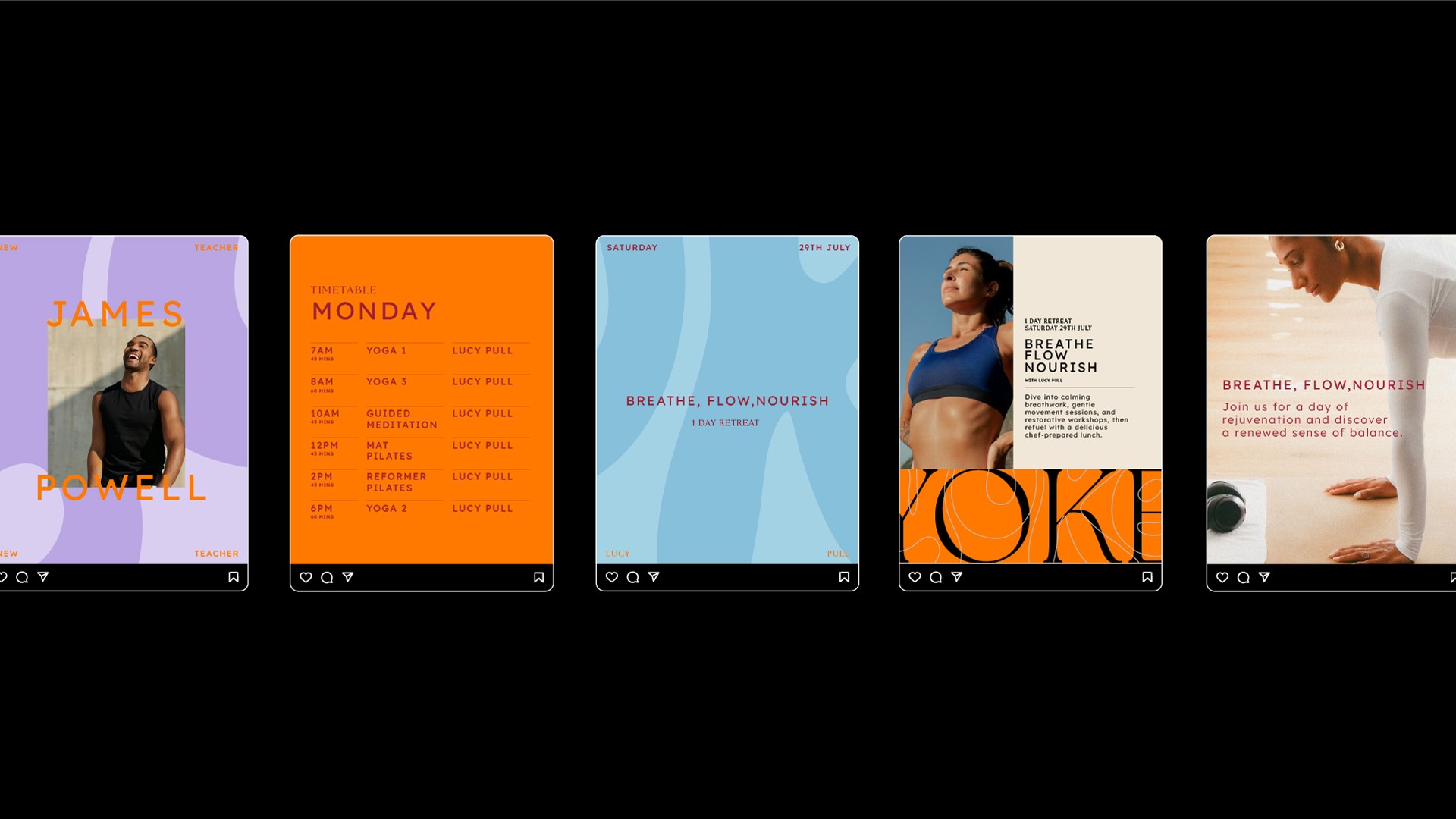
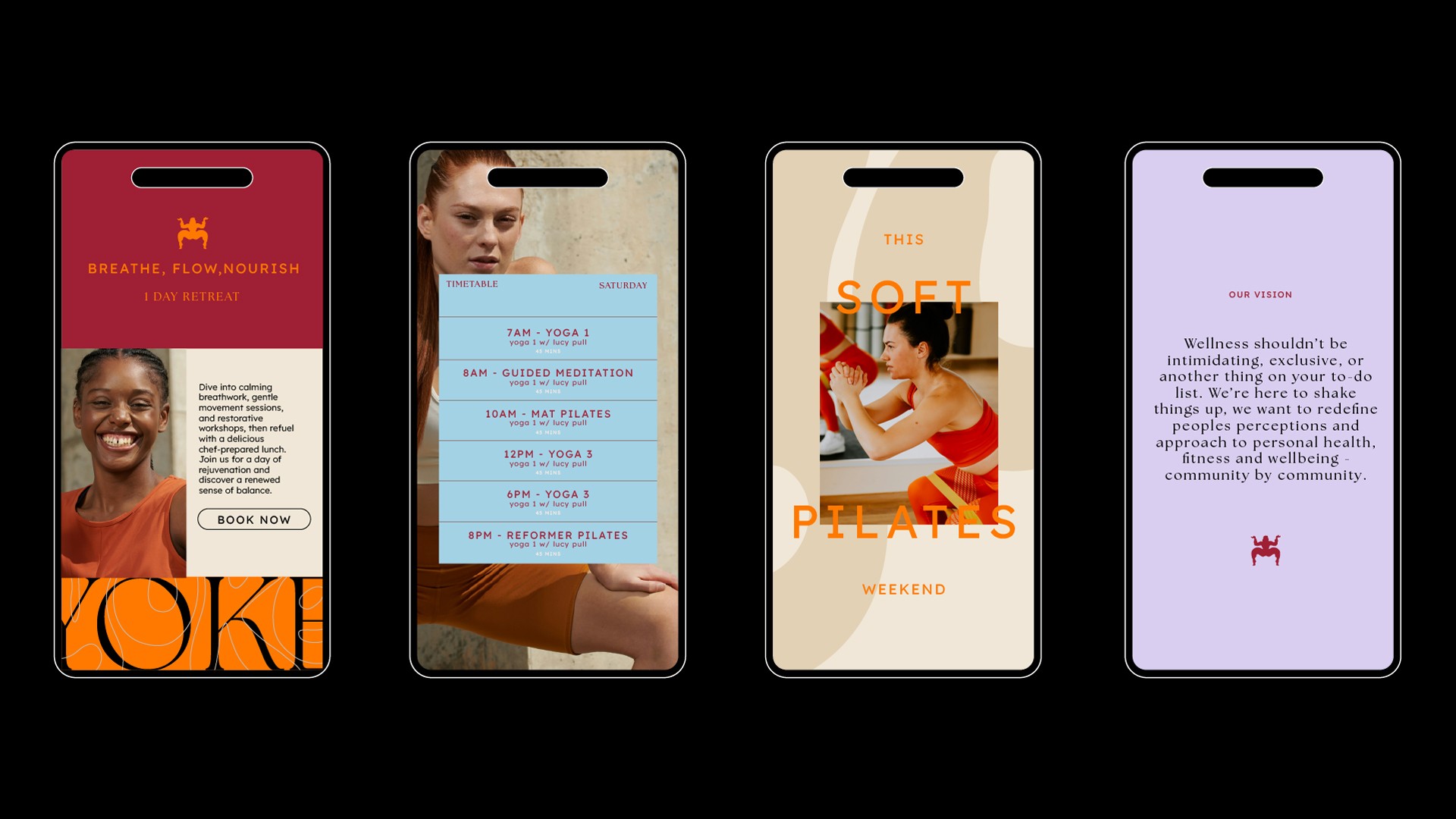
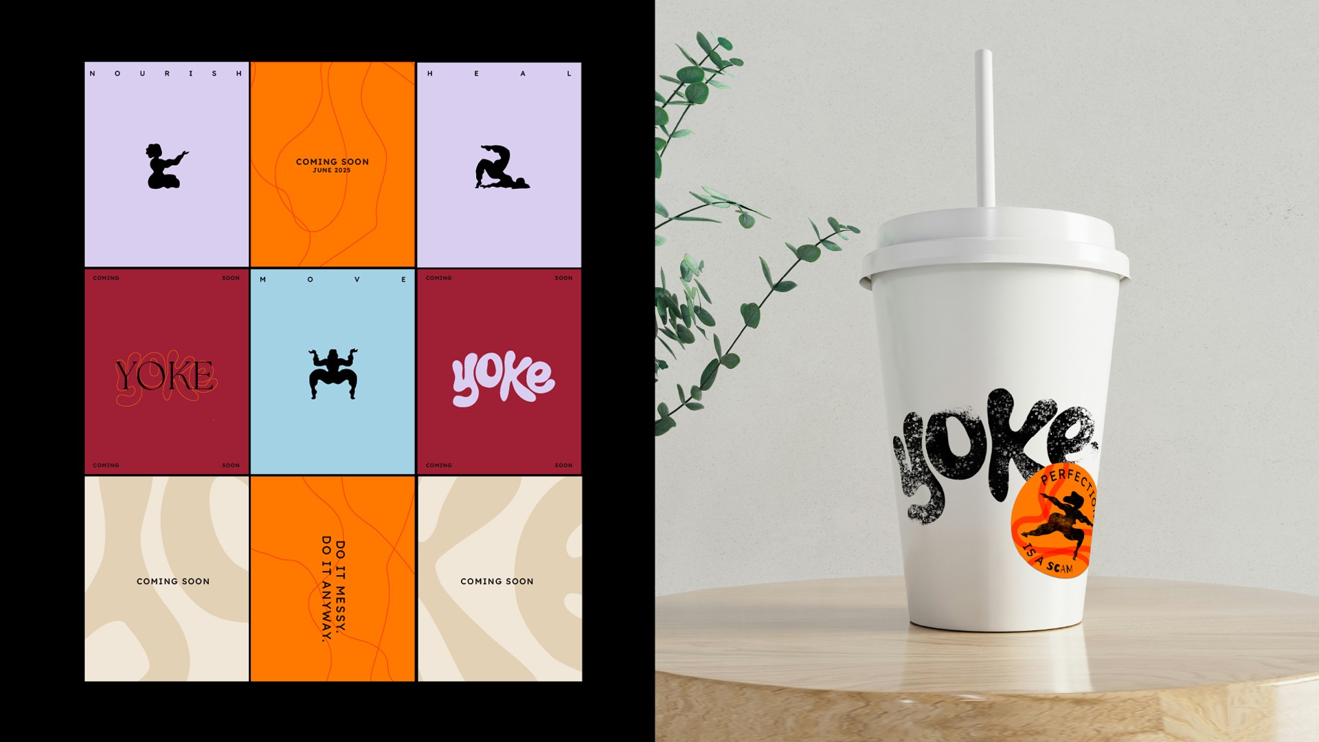
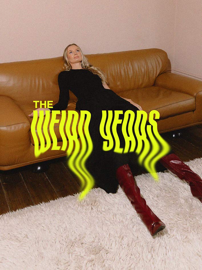
Launching in West London’s saturated wellness market meant Yoke needed a brand that could cut through the noise. But unlike many competitors, they weren’t chasing elitism or aesthetics. They wanted something different—an identity that celebrated imperfection, prioritised inclusivity, and made people feel at home.
How we solved it
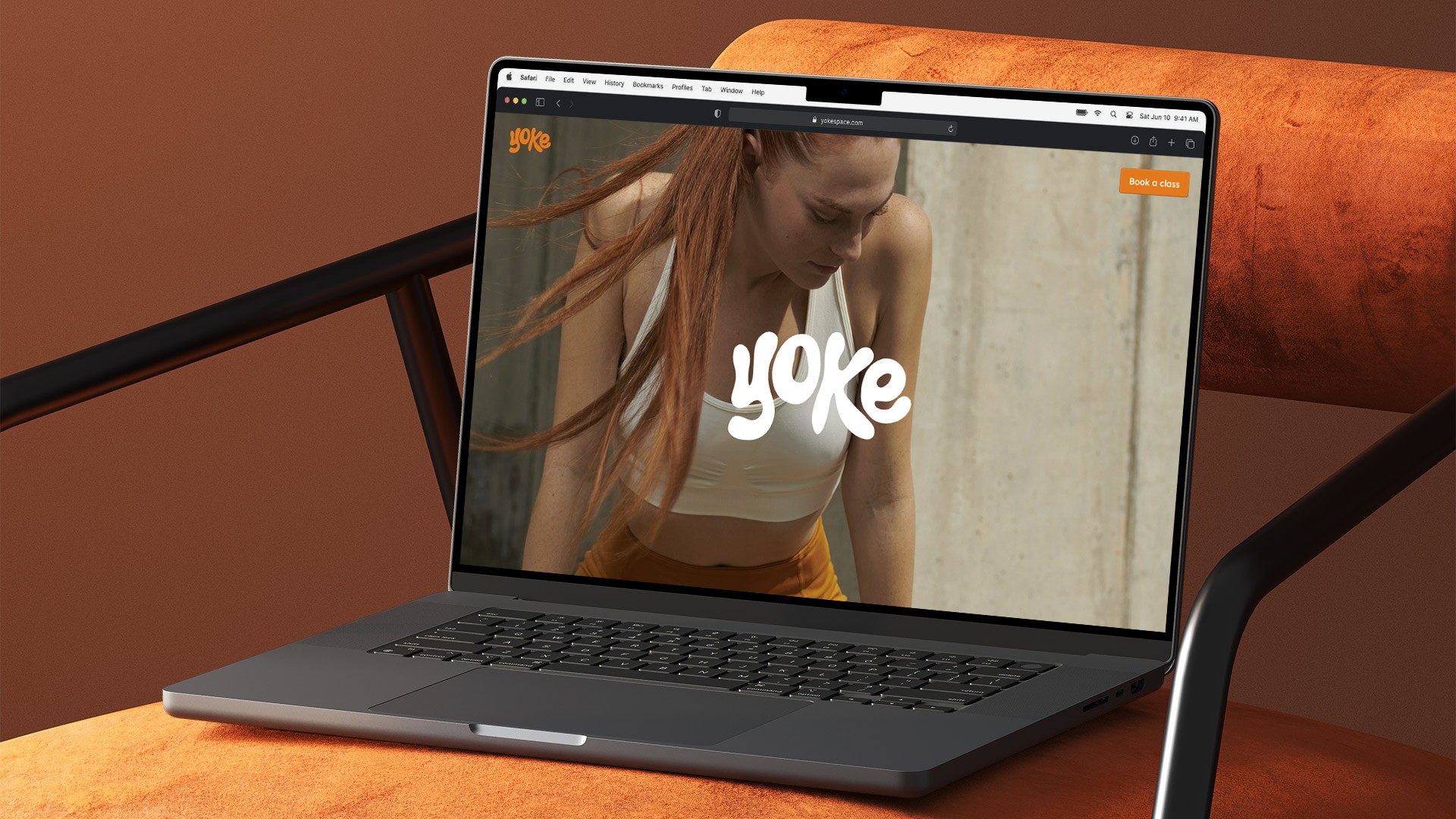
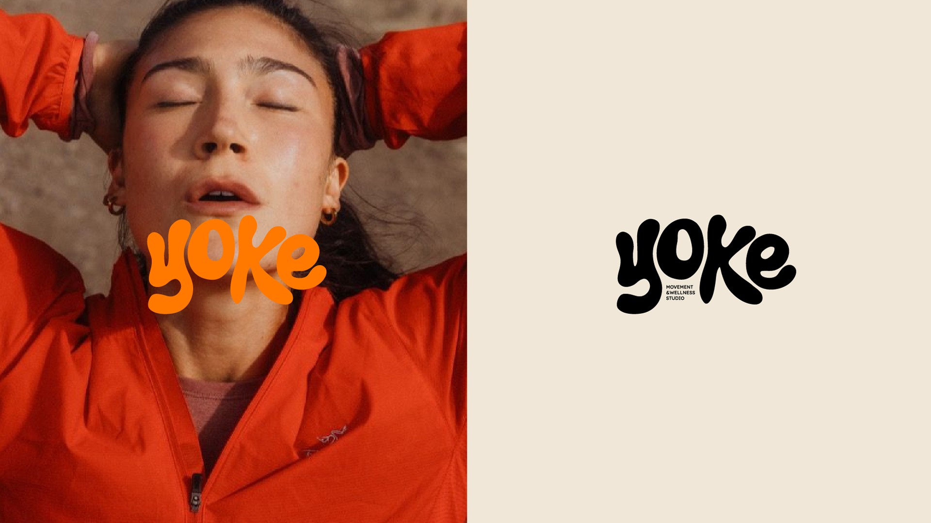
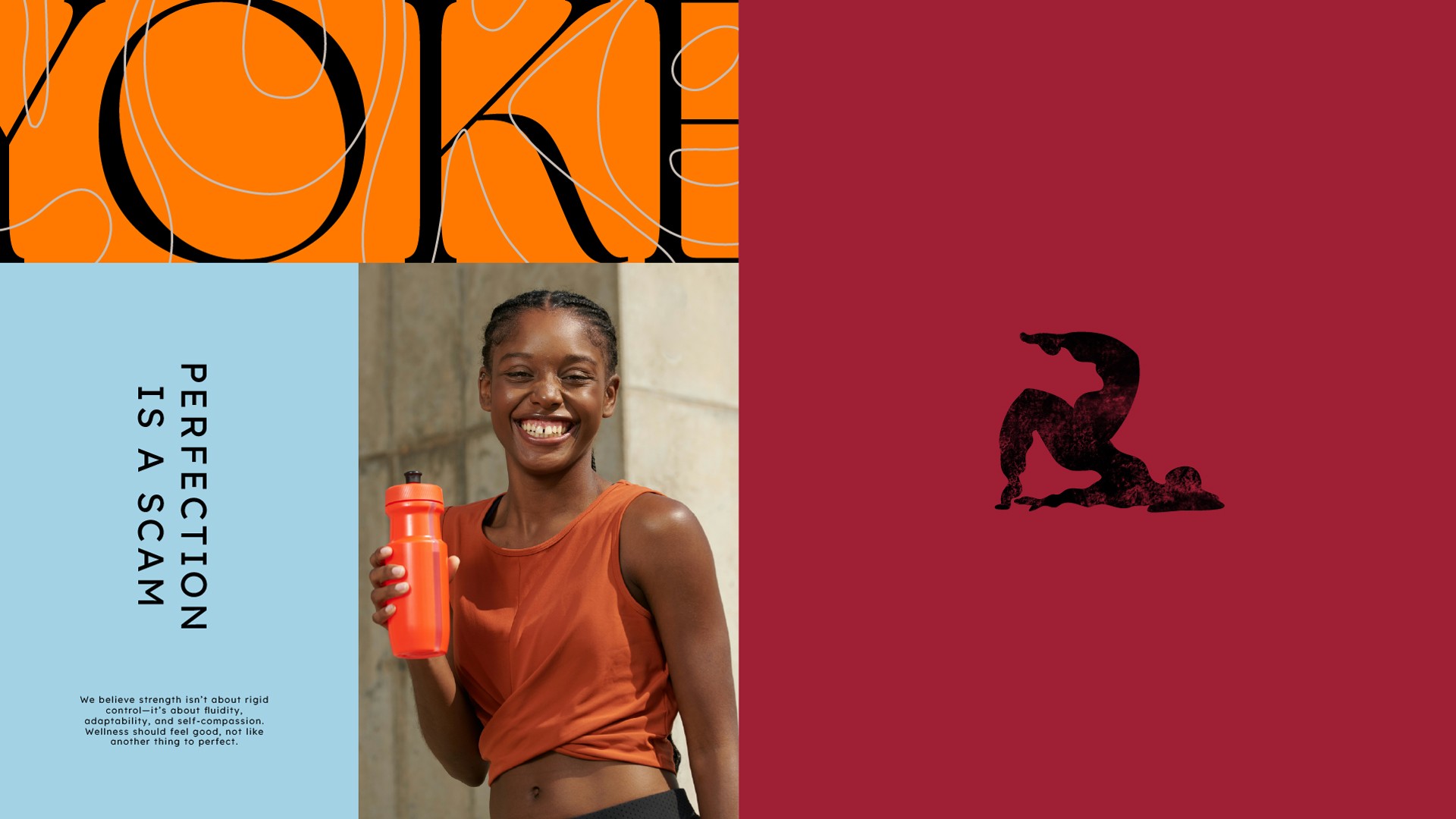
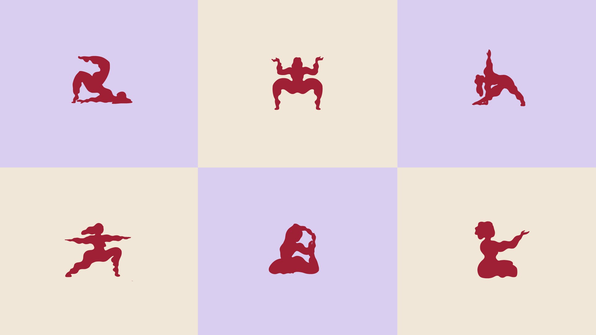
We created a brand that brings Yoke’s values to life—rooted in community, balance, and a refreshingly honest approach to wellness. The visual identity pairs soft, grounded design with bold personality, reflecting a space that’s equal parts calming and energising. Messaging is warm and real, championing feel-good movement over filtered perfection. From colour palette to typography to tone of voice, every element invites people in. The result is a brand that positions Yoke as a standout sanctuary in West London: approachable, grounded, and built to last.
Wellness studio
Wellness studio
Wellness studio
March 2025
March 2025
March 2025
Branding
Branding
Branding
The challenge
Launching in West London’s saturated wellness market meant Yoke needed a brand that could cut through the noise. But unlike many competitors, they weren’t chasing elitism or aesthetics. They wanted something different—an identity that celebrated imperfection, prioritised inclusivity, and made people feel at home.
Launching in West London’s saturated wellness market meant Yoke needed a brand that could cut through the noise. But unlike many competitors, they weren’t chasing elitism or aesthetics. They wanted something different—an identity that celebrated imperfection, prioritised inclusivity, and made people feel at home.
Launching in West London’s saturated wellness market meant Yoke needed a brand that could cut through the noise. But unlike many competitors, they weren’t chasing elitism or aesthetics. They wanted something different—an identity that celebrated imperfection, prioritised inclusivity, and made people feel at home.
The solution
We created a brand that brings Yoke’s values to life—rooted in community, balance, and a refreshingly honest approach to wellness. The visual identity pairs soft, grounded design with bold personality, reflecting a space that’s equal parts calming and energising. Messaging is warm and real, championing feel-good movement over filtered perfection. From colour palette to typography to tone of voice, every element invites people in. The result is a brand that positions Yoke as a standout sanctuary in West London: approachable, grounded, and built to last.
We created a brand that brings Yoke’s values to life—rooted in community, balance, and a refreshingly honest approach to wellness. The visual identity pairs soft, grounded design with bold personality, reflecting a space that’s equal parts calming and energising. Messaging is warm and real, championing feel-good movement over filtered perfection. From colour palette to typography to tone of voice, every element invites people in. The result is a brand that positions Yoke as a standout sanctuary in West London: approachable, grounded, and built to last.
We created a brand that brings Yoke’s values to life—rooted in community, balance, and a refreshingly honest approach to wellness. The visual identity pairs soft, grounded design with bold personality, reflecting a space that’s equal parts calming and energising. Messaging is warm and real, championing feel-good movement over filtered perfection. From colour palette to typography to tone of voice, every element invites people in. The result is a brand that positions Yoke as a standout sanctuary in West London: approachable, grounded, and built to last.


A wife & husband design studio that creates killer brands and premium websites.
© 2026 Fifteen South
A wife & husband design studio that creates killer brands and premium websites.
© 2026 Fifteen South
A wife & husband design studio that creates killer brands and premium websites.
© 2026 Fifteen South
A wife & husband design studio that creates killer brands and premium websites.
© 2026 Fifteen South